Home Project Team M1 M2 M3 M4 Project
M2: Proposal + Lo-Fi Prototyping - May 5+7
Dokumentation:
Tasks & OwnershipUser:
Matthew - A CityBike-Employee utilizing this Implementation is most likely a TeamLead/Manager in the logistics.
Goal:
Enabling CityBike Employees to forecast and plan ahead by providing them with an interactive and adjustable tool visualizing historic trends and usage. Aiding users to predict the usage for a future time period but also allowing them to adjust certain parameters changing the automatically generated prediction.
Scenario:
Matthew works at CityBike Vienna and is in charge of logistics. This means he takes care of managing the CityBike stations by refilling them with bikes when needed, picking up broken bikes or relocating bikes.Matthew faces daily challenges ensuring the stations are full and enough working bikes are available. Today Matt wants to plan ahead and forecast next weekends (Filter Tag, Woche, Monat, Wochenende etc) usage. Vienna isn’t as big as Paris but still has 120 Stations. To narrow down his options he decides to focus on the 2nd district first (Filter für Bezirke). There are 12 stations (Filter für Stationen) and since it is in the heart of the touristic area he takes all stations into consideration. Matt is now able to see a calculated prediction for the selected timeframe, district and stations. It shows him a number of bikes which could possibly be rented. The toli also allows him to select a specific day and see the usage throughout it (Rushour etc).
After reviewing the data Matt is interested to see what last weekend looked like for his selected criteria. He modifies the selected weekend and now sees the prediction generated for that historic time frame vs the actual usage. The usage was higher than predicted and Matthew now fears the same thing could happen again this weekend. He now decides to set new Parameters for the prediction. He edits the historic prediction so it is accurate, saves these and applies the increase on his future prediction for next weekend. The initial search results have now been modified and shows the changes.
Matt is happy with this forecast and begins to plan the needed bikes and staff for the 2nd district next weekend.
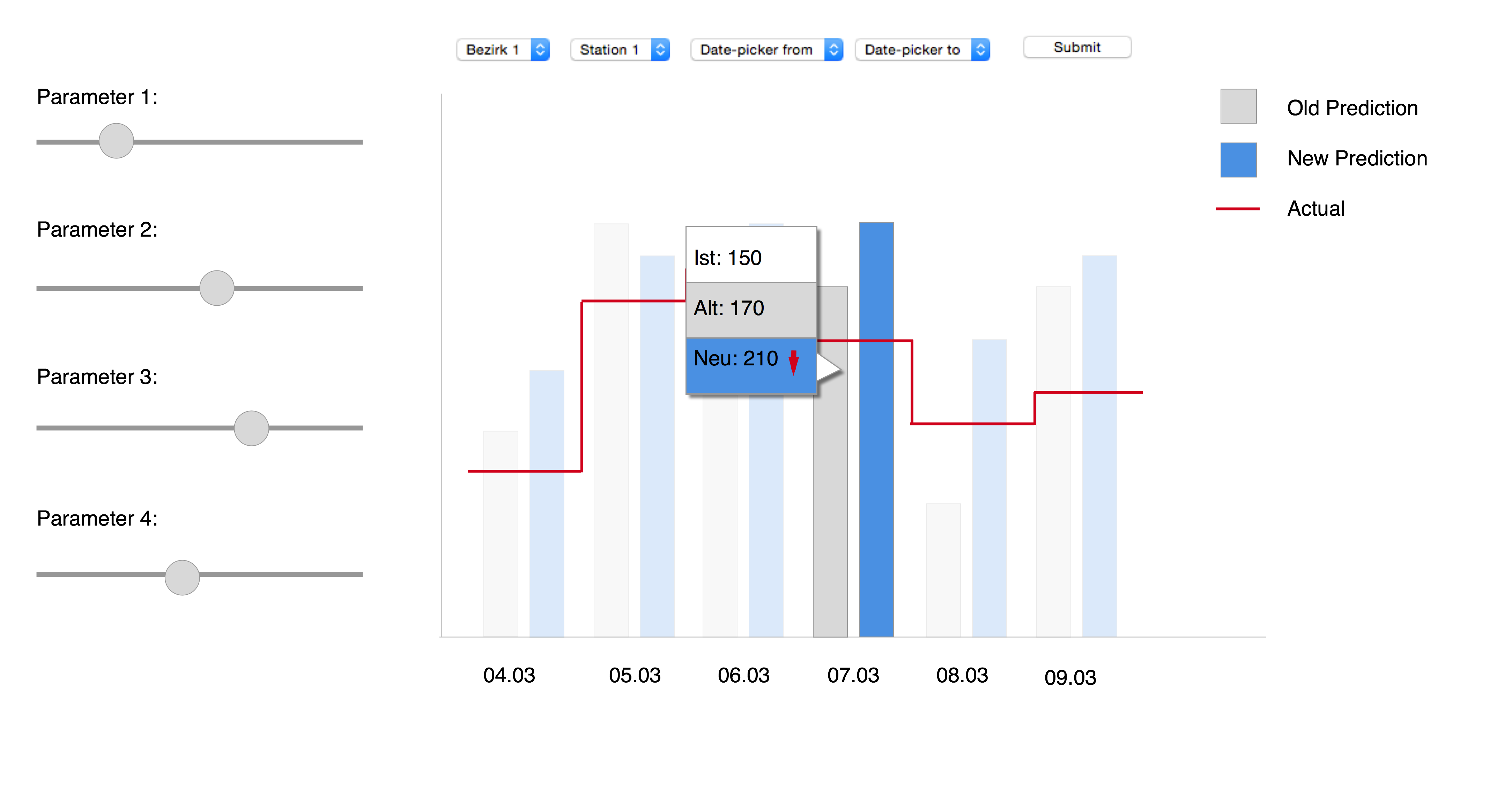
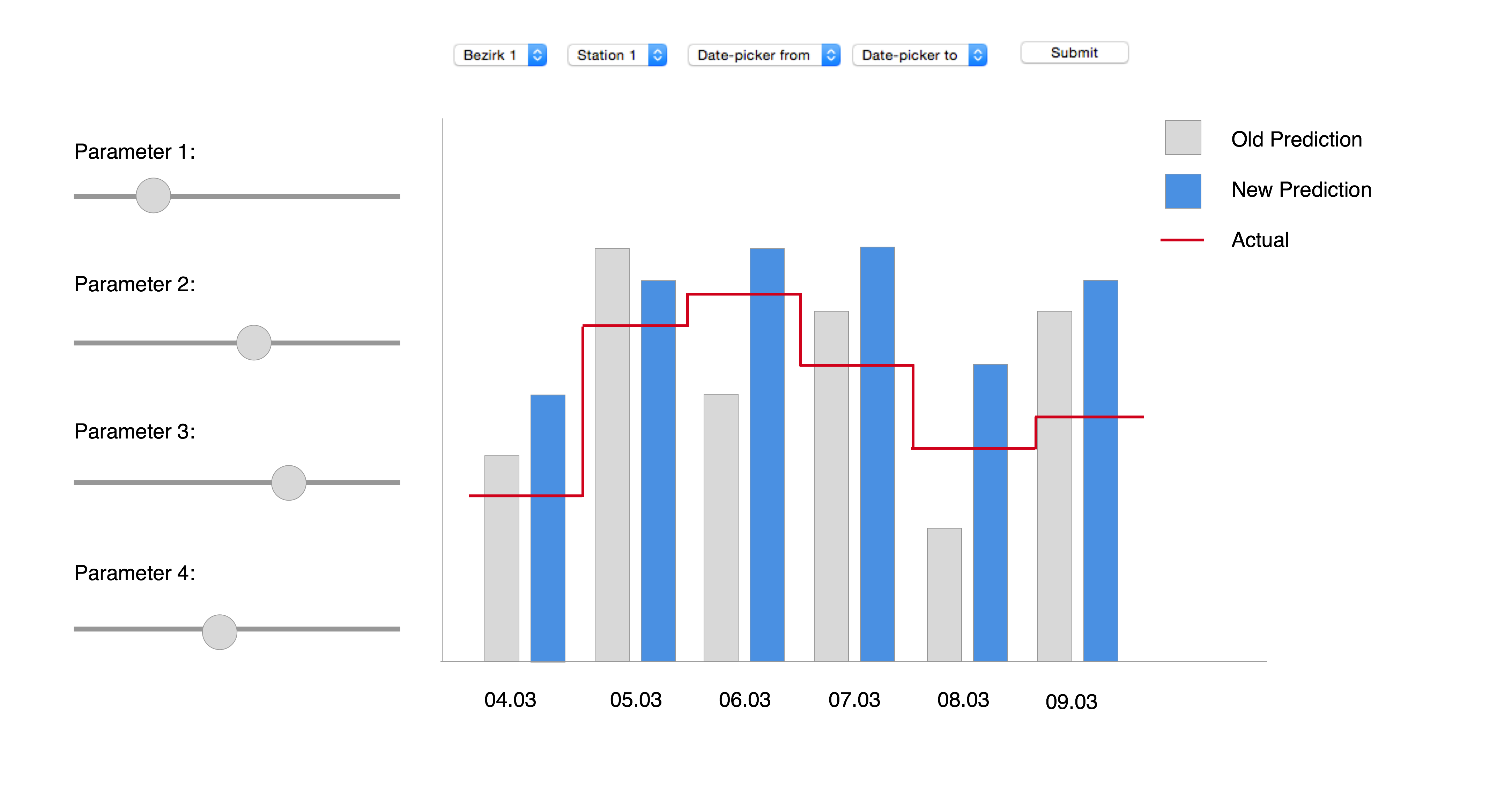
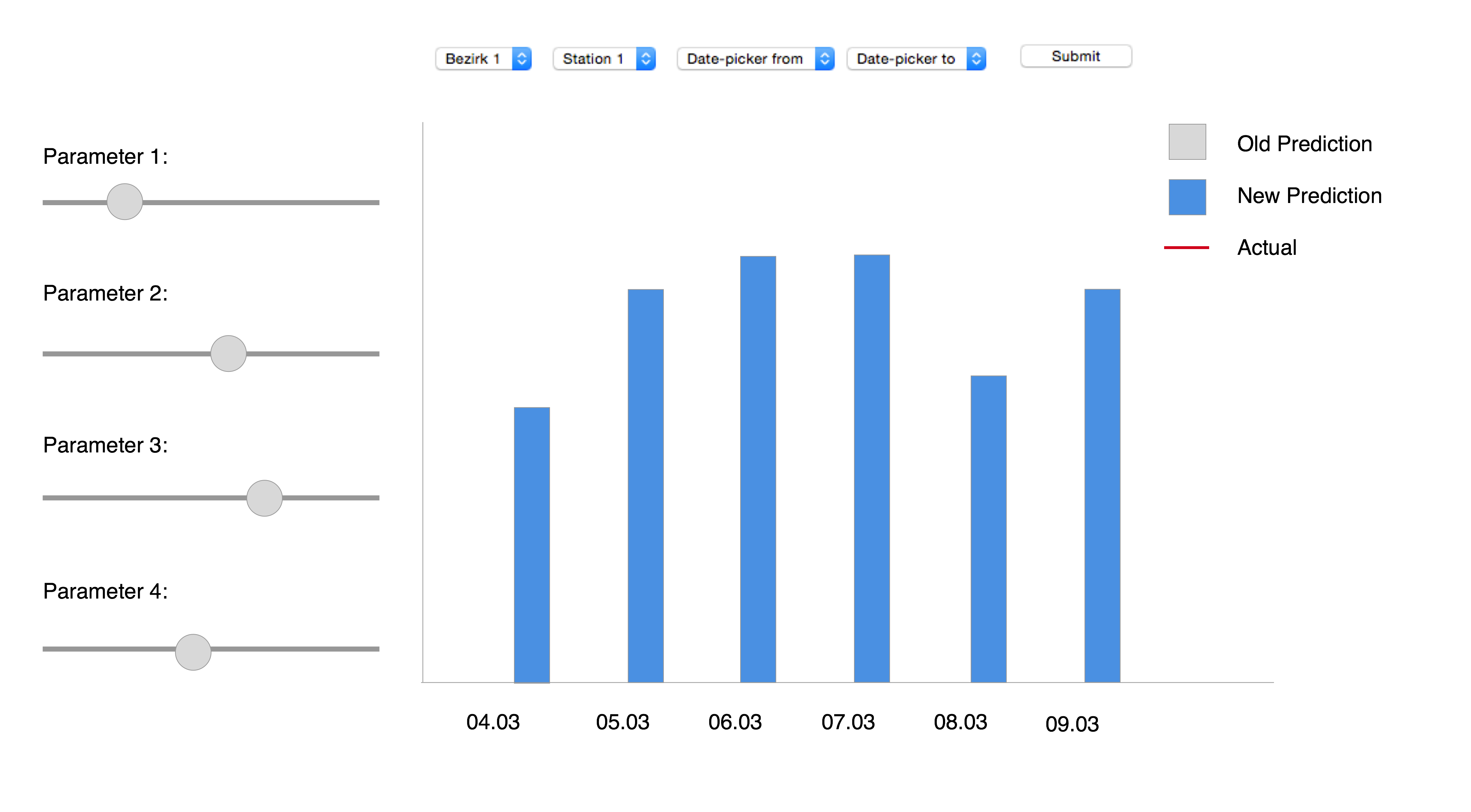
Mockup A
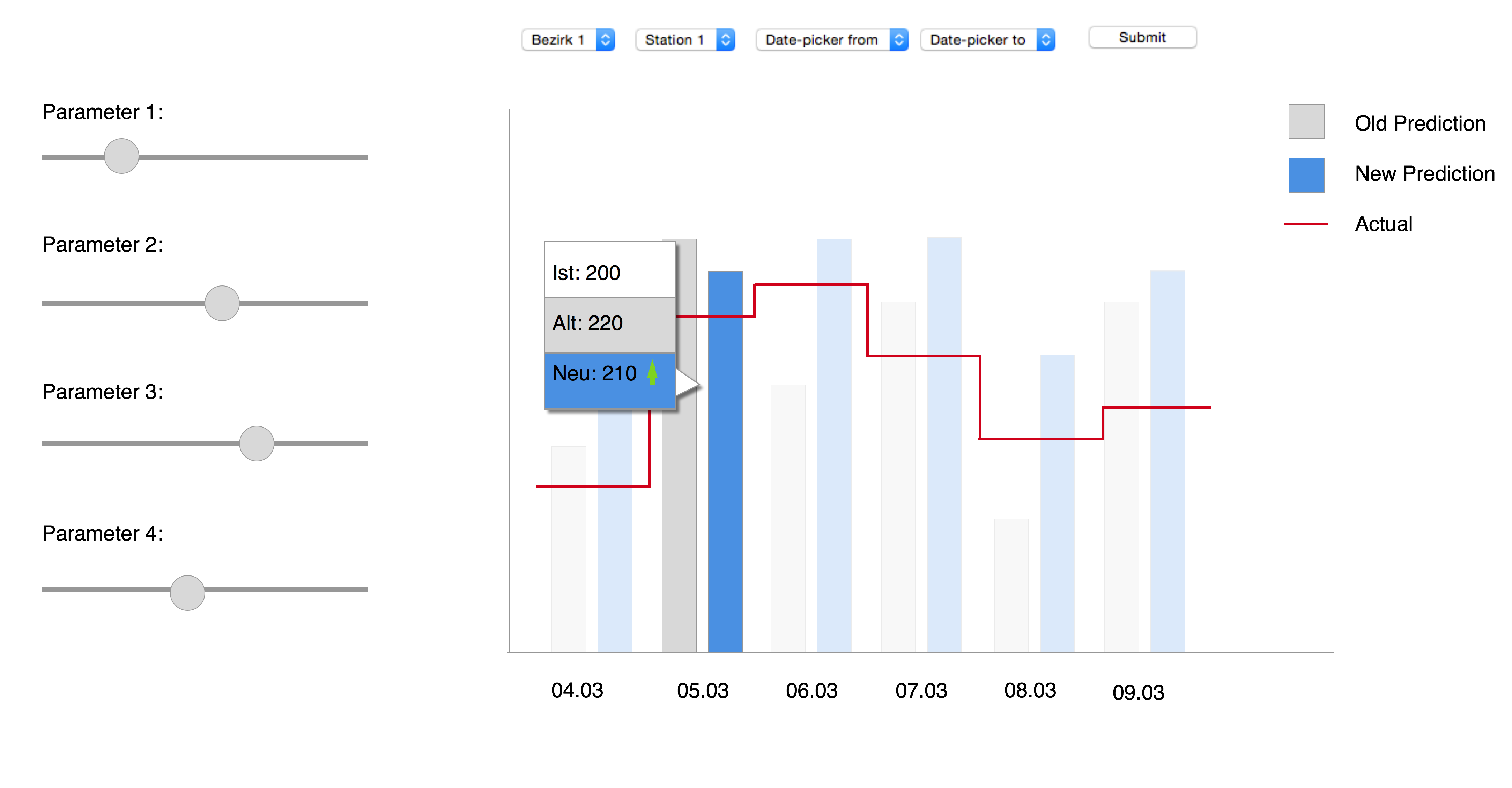
- (if available) the actual number of users (red line)
- The old predicted values (grey bars)
- The current predictions (blue bars)
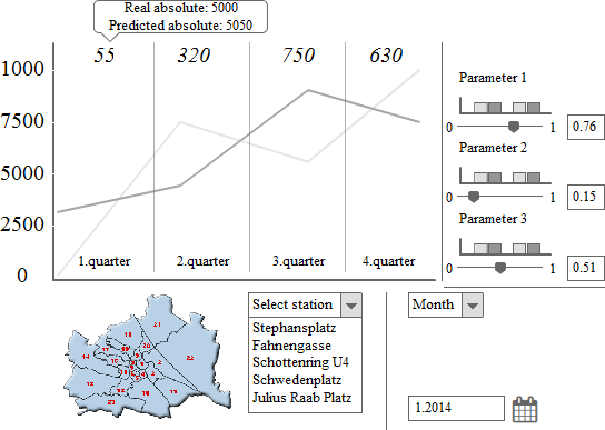
Mockup B
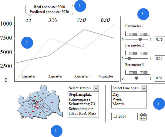
Mockup B is a line diagram.
- shows the filter for the stations. You can filter the main view by district if you click on a district. If you selected a district the dropdown menu changes. If a specific station is selected the main view also changes.
- shows the filter for the time. You can change between the day, week and month view. You can also change the date for the specific view. The selection has an impact on the main view.
- shows the parameter that change the formula. You can edit each parameter by the slider or the field. The changes are shown in the field. The barchart over the slider show where the formula is better or worse.
- is an area of the main view. On the top of each area you can see the absliute difference between the predicted line and the real data. If you hover over the number you can see the absliute numbers for the predicted data and the real data.
- is the main line diagram view.
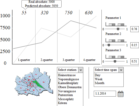
This picture shows how the map changes (#1) if a district is selected.
Mockup C - Detailed Description
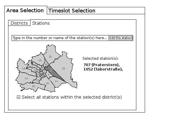
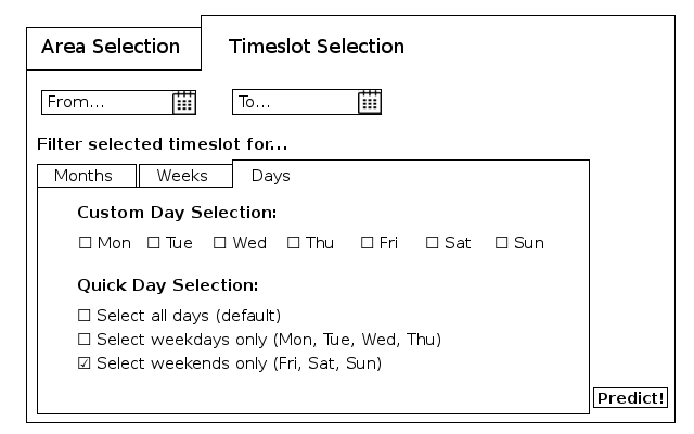
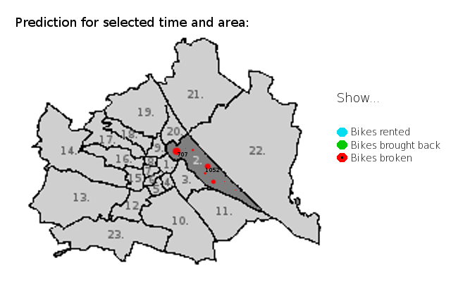
User: Matt, in charge of the logistics for CityBike Vienna. We assume he knows the stations by their number. Furthermore, we assume that he is familiar with Vienna's geography (he can orient on a map of Vienna). Task: Matt needs a prediction for the amount of damaged bikes for all of the city bike stations in the second district for the upcoming weekends . Here is a step-by-step description for Matt in order to complete his task. a. Area Selection - Districts: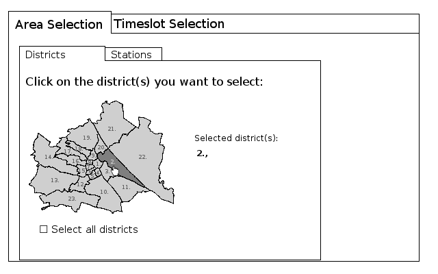
Implementation details
For our implementation, we will most probably be using the JavaScript D3 and/or Chart.js libraries. For the design, we might use the Bootstrap CSS Framework. These choices are however not intended to be exhaustive or final.Discussion Points
- Which Mockup do you all think is most suitable for the solution we are trying to visualize?
- What else would you like to see in the tool if you were a CityBike Employee such as Matthew?
- Are there other ways you would have opted to display the data?
- Other Questions?
References:
Appendix
Additional images to Mockup A: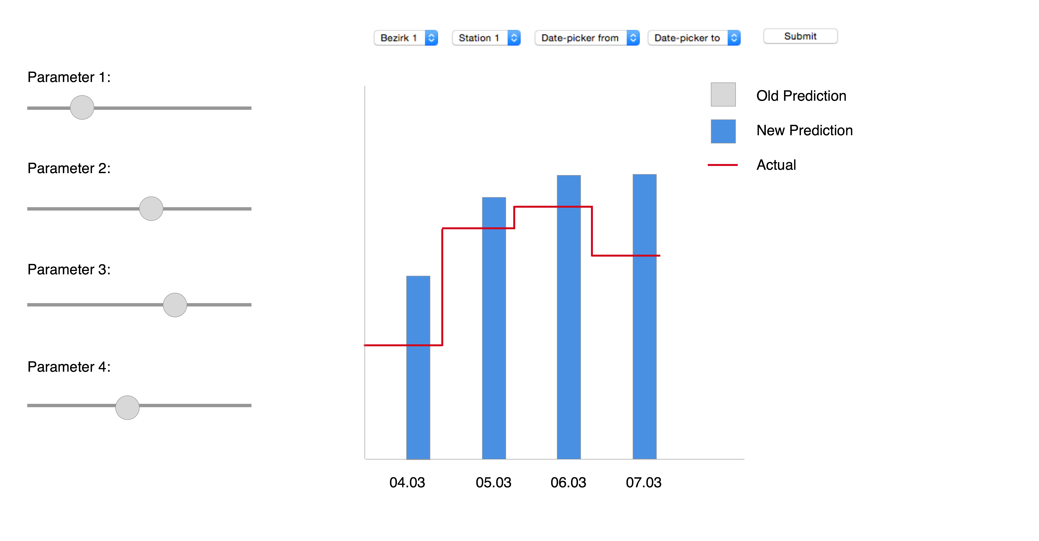
Additional images to Mockup B:
This picture shows how the main view changes when you select 'month' (#2) as a time span.
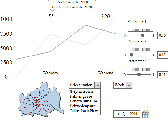
This picture shows how the main view changes when you select 'week' (#2) as a time span.
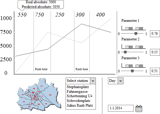
This picture shows how the main view changes when you select 'day' (#2) as a time span.